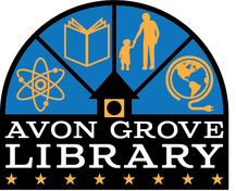
Designed by local graphic artist Garo Yepremian Jr. (pictured below), each part of Avon Grove Library's logo holds significant meaning. Read about it in the artist's own words below.
|
"My intent in designing this logo was to invoke a feel for the character of Avon Grove Library and the various activities it offers to our community, while honoring the library’s past.
Visual ties to the library building include the half-round window above the entrance, and the clock tower. While the half-round window is a reference to a physical building element, it has a much deeper meaning when viewed as a “hub” symbol, conveying that all paths lead to the center, where the clock tower icon is depicted. The library’s new tagline, “Connecting Our Community,” is a sentiment that is reflected in the logo, as it illustrates the community coming together to enjoy all that the library offers. The icons appearing between the hub spokes include STEM symbols, a book, a parent with a child, and a symbol for digital connectivity. The stars across the bottom of the logo represent the eight local municipalities the library serves. The style of the font/typeface is a nod to the library’s rich history, a modern interpretation of the lettering found on the signage outside of the library’s previous locations." See more of Garo's work at GaroJrDesign.com. |


